Design once. Stay on-brand.
Ship with confidence.
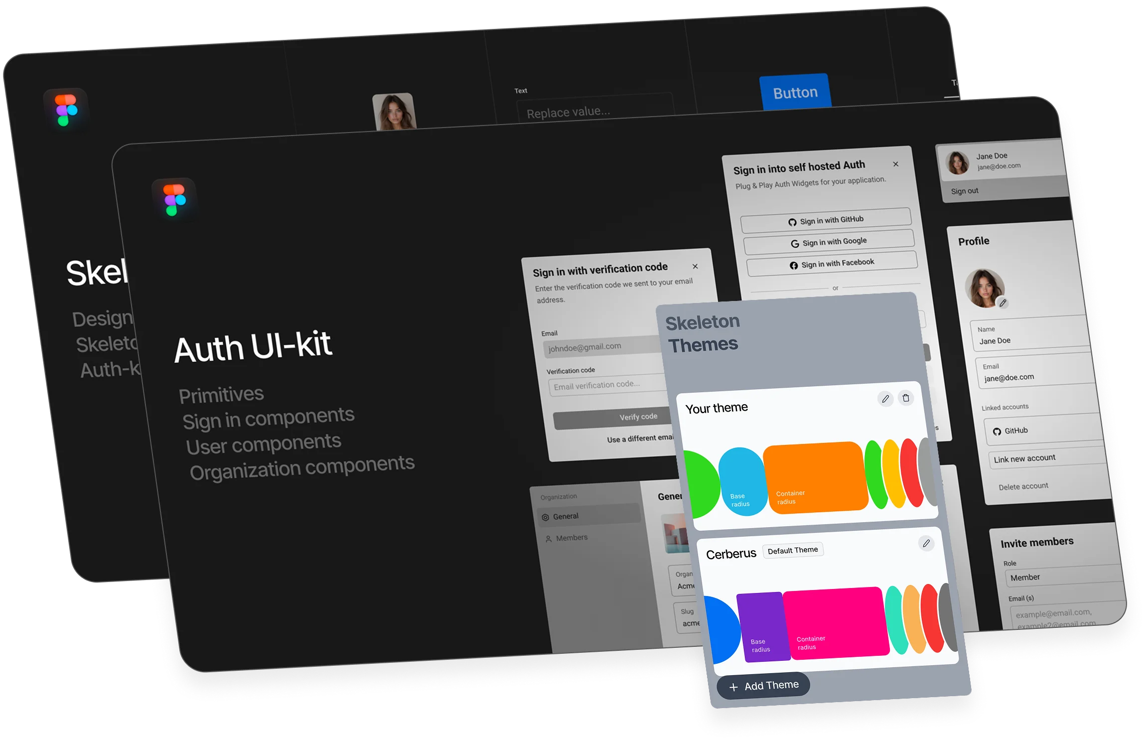
Two Figma kits that mirror production: a Primitives + Design System kit and a real-world Auth UI kit. Token-driven, theme-aware, and mapped 1:1 to the components your engineers ship.
Still rebuilding primitives and chasing consistency? Specs drift between Figma and code? States, variants, tokens—never quite aligned? Themes don’t scale across brands?

Two focused
Figma kits
One consistent system
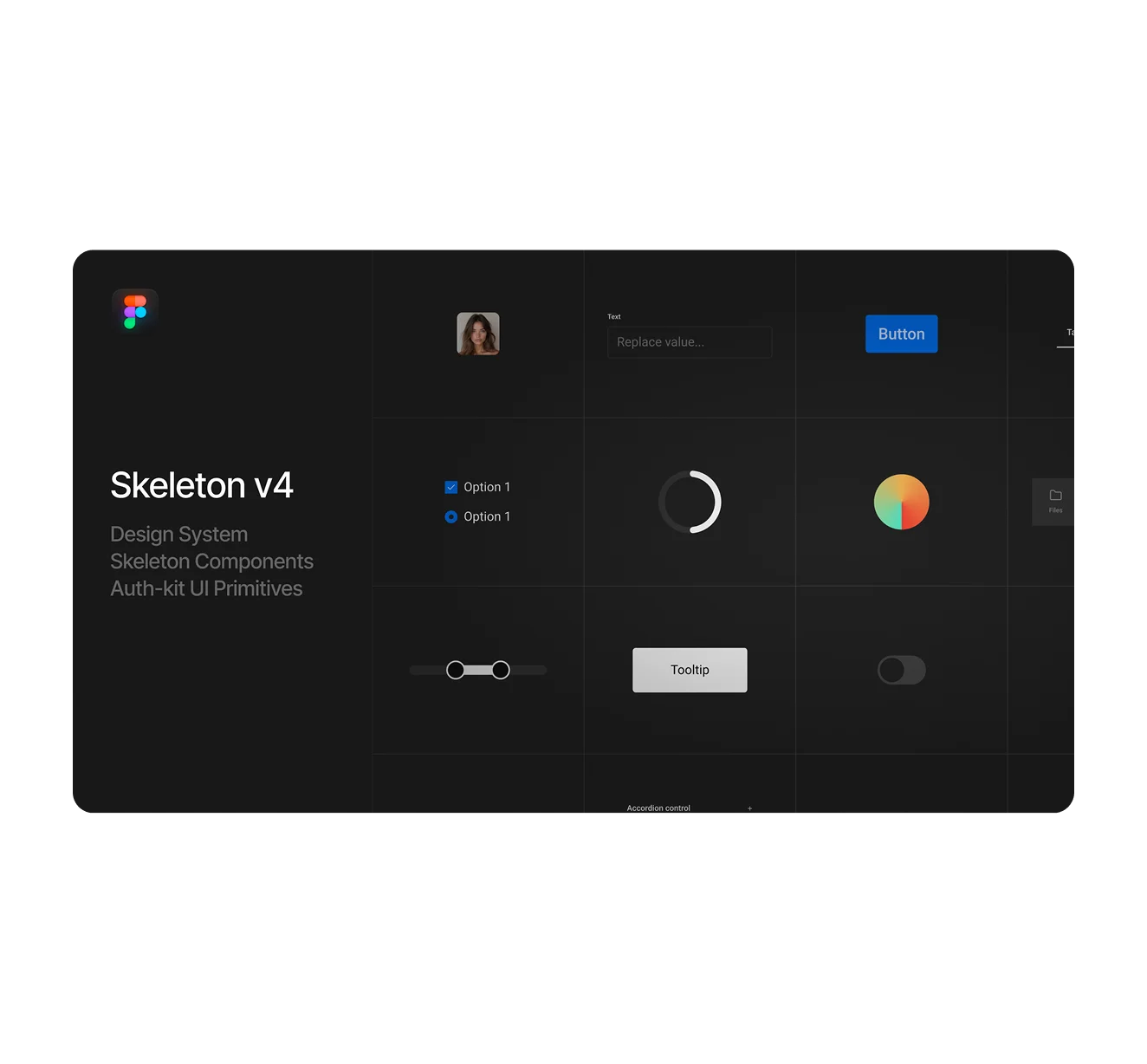
All core Skeleton components rebuilt in Figma with full variant coverage. Token-driven, dark/light, and ready to theme.
Accordion, modal, inputs, tables, etc
Color/typography/spacing with dark/light support.
Import your Skeleton themes to style components instantly.
Naming and states mapped for handoff.
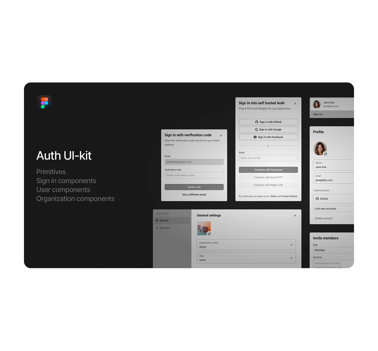
Authentication screens and flows that mirror real app behaviour.
Optimized for our self-hosted Auth stack (Better Auth + Convex) — yet fully
usable as a standalone Figma kit. Design with production parity and hand off without
surprises.
Sign-in/sign-up, reset/verify, 2FA patterns
User profile, organizations, role/permission accents.
Social vs email/password with modeled success/error states.
Organization Switcher & UserButton wired to related screens (mini prototype).
Token-driven components mapped 1:1 to our Auth widgets and themes.
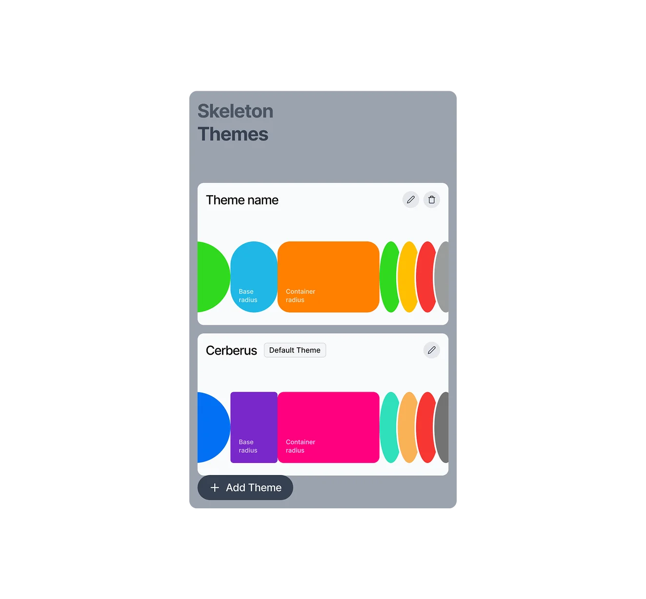
Create or import themes in our hosted Theme Editor, then pull them into Figma with the Plugin. Apply once—your tokens cascade across the Primitives kit and (when bundled) the Auth UI Kit. Push themes to GitHub & Figma to keep product and design in lockstep.
Design, preview, and version tokens for light/dark & brands
Pull themes from the Editor and apply across components instantly
Swap brands or palettes without redrawing a screen
Push themes to GitHub & Figma for consistent handoff
"...the Figma is very well put together and the most robust that I could find out of all the UI kits so our company chose to go with Skeleton 🙂"
Rob, Skeleton community member Join 4500+ designers & developersPreview the Kits
Switch between the live files. Everything you see is token-driven and theme-aware.
Get Access
Choose the kit that fits your workflow—or get both for seamless app design from primitives to auth.
Includes updates to the kit and priority fixes as we ship new primitives & auth patterns.